Locate the Custom Dashboard Views
To locate the custom dashboard views in Stratusphere, complete the following steps:
- Log in to Stratusphere.
- Click the Advanced tab at the top of the screen to enter the Stratusphere UX Advanced mode.
- Click the Dashboards tab.
- All of the available Stratusphere UX Custom Dashboards then appear on the screen.
-
Navigate the Custom Dashboards
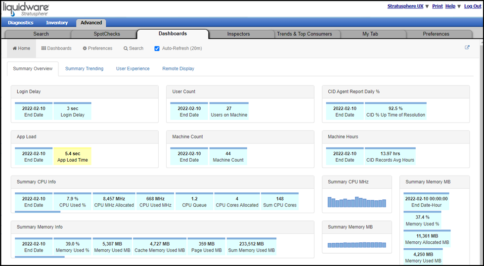
The Advanced Mode Dashboards are comprised of custom-built tabs. Stratusphere provides a few dashboard views out of the box to get you started, while the easy-to-use builder allows you to create custom views that focus on the KPIs and information that matter most to you.
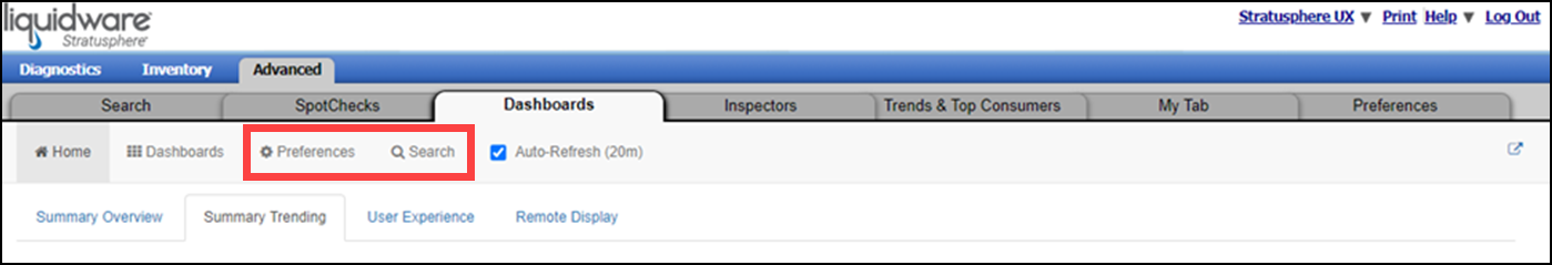
Dashboard options, including Preferences, Search, and Auto-Refresh, can be found at the top of the dashboard view.
Set Preferences
Dashboard Preferences allow you to set start-up behaviors and general settings including the following:
- Dashboard Theme: Default or Dark mode
- Refresh: Dashboard refresh rate
- Default Date: Default search date such as Today, Last 30 Days, 5 Weeks Ago
- Enable Edit Mode: Option to create your own custom dashboards
- Search Settings
- Dashboard Import Utility
Run Searches
The dashboard Search controls provide you with the ability to customize the data displayed on the dashboard by first selecting values for any or all of the following parameters:
- Date Range
- Time Range
- Resolution —Allows you to define the granularity of data so that you can see more or less detail
- User
- Machine Name
- Machine Group Name
- User Group Name
- Current Host Name
- Datastore Name
After setting your parameters, scroll to the bottom of the search controls list and click on the Go button to execute the query.
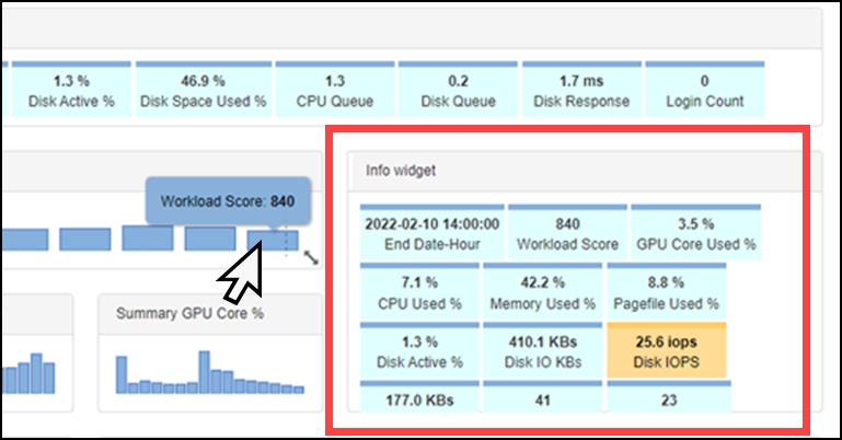
View Widget Information
Hovering your cursor over some of the widgets on the screen causes the Info widgets region to auto-populate with details about that particular widget. In the image below, user experience details appear when the cursor is placed over the Average Workload Score widget.
Use Case Example: Creating a Custom Dashboard
Advanced Mode Custom Dashboards enable you to organize and define key performance indicators (KPIs) as well as other measures of success in the management and delivery of end user workspaces. Perhaps you are looking to better understand and operationalize the delivery of a key application. The following example looks at Google Chrome and starts by using the Applications dashboard view.
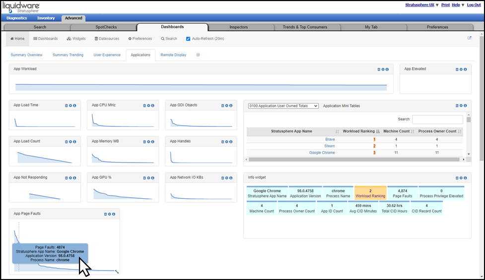
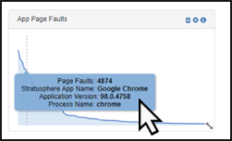
Hovering your cursor over the App Page Faults sparkline widget in the bottom-left corner of the tab brings up a popup window showing that Chrome is the top resource consumer in the environment. The application also experienced the most page faults (4874).
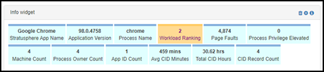
At the same time the popup window appears, the Info widget field auto-populates with additional information about the app page faults, such as the fact that Chrome was witnessed on 4 machines with 4 different process owners.
Clicking the App Page Faults sparkline widget causes a more detailed table of relevant information to pop up. This table includes a complete list of all user-owned applications observed during this time period, as well as details on machines, process owner counts, and total execution times for each application and process.
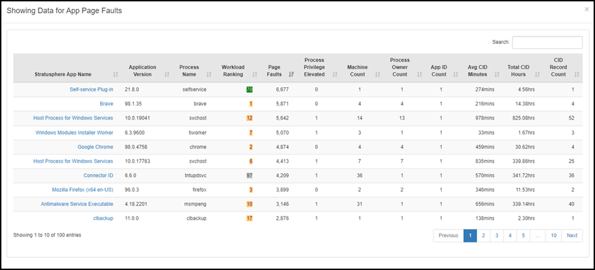
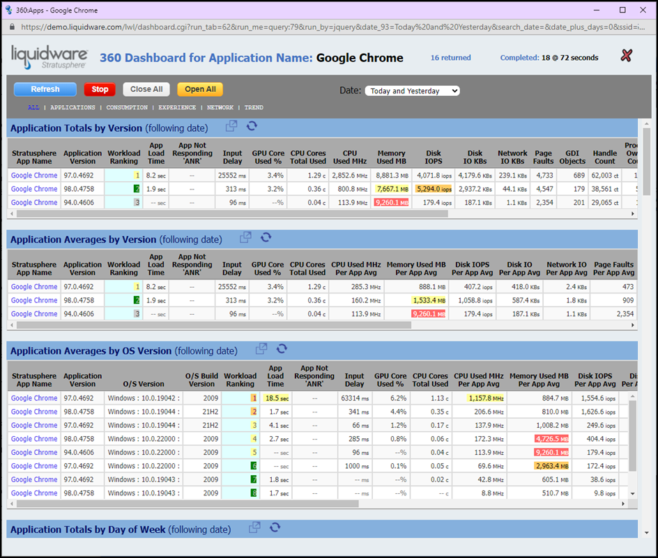
By clicking an entry in the table, you can explore Google Chrome and gain a complete 360 Dashboard view of the application, including all the machine and user names that have been running the application during the selected timeframe. This 360 view includes almost 20 tables of information such as Application Totals by Version, Application Averages by Version, and Application Totals by Day of Week. Each of these tables, in turn, display details about the user experience values and resources consumed for that metric.